New shadow test
Completely redid the shadow system because I was unhappy with how difficult it was becoming to generate a shadow on walls/ceiling with my original method.
In other news, the shadow can now be properly cast on walls and ceilings!

Completely redid the shadow system because I was unhappy with how difficult it was becoming to generate a shadow on walls/ceiling with my original method.
In other news, the shadow can now be properly cast on walls and ceilings!
Finally back to working on engine stuff, decided it was about time to get the shadow to function on walls so I can more comfortably get started on level design. Haven’t implemented many cases yet, but was generally satisfied that I threw some more trig into the code and it worked as expected.
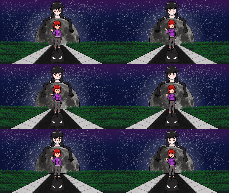
An extra addition to the site refresh, I updated and animated the old SELUNA title card!

This ended up being a little more work than I expected, mostly because I didn’t have a lot of the parts in the original image separated in a way that would support animation like this. Photoshop to the rescue on this one.
Proud to say that, after several years with the old layout, I am now (mostly) finished with refreshing this website. Not only is there a new theme and page organization, but I’ve also added my logo (Detta’s Designs), created a page for one of my latest projects (Bel), and expanded the SELUNA character page with new art,
Did some menuing work. Obviously not complete but just wanted to experiment with a few things.
Decided to start revamping the text/dialogue system after messing around with the title screen pixel art I made a while back. Since the sprites are so small I felt it would be difficult to make them into meaningful poses for cutscenes, and the mugshots I had before could only convey facial expressions (also I didn’t like how they looked anymore).